
Key Takeaways
Warm neutrals remain the foundation for versatile kitchen design.
Deep forest greens bring calm and pair best with natural stone.
Grey palettes offer subtle contrast; light to dark tones suit different spaces.
Soft pastels add vintage charm without overwhelming.
Jewel tones work best as accents or two‑tone schemes.
Monochromatic layouts create depth in a single hue.
White oak and other wood grains inject natural texture.
Match cabinet color to layout, appliance finish, and room size.
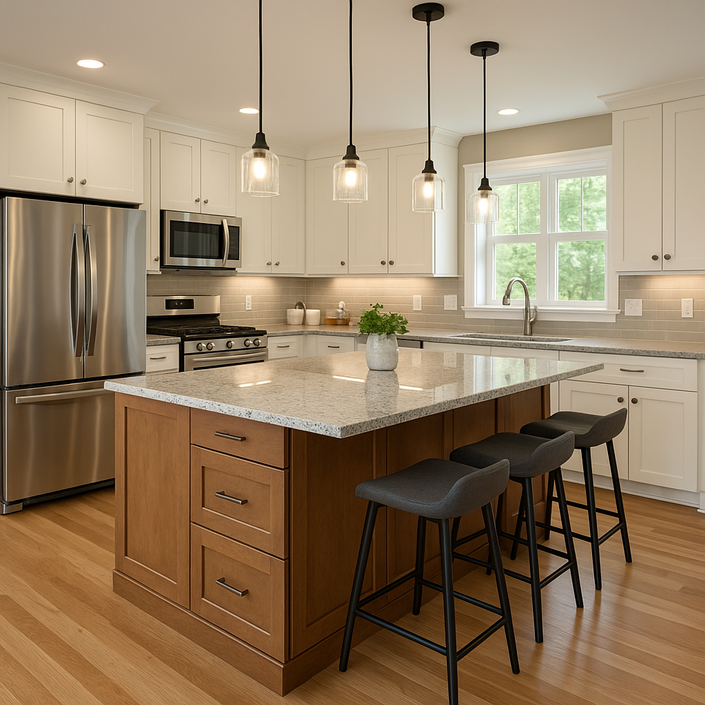
1. Warm Neutrals: Timeless Base for Every Style

Warm neutrals hold strong in 2025. Creamy whites, soft beiges with peach undertones, taupe, and greige give a calm backdrop. They adapt to any style—from modern minimal to classic shaker.
Hardware Pairings
Matte black for modern contrast
Brushed brass for subtle warmth
Countertop Choices
White quartz keeps the look bright
Calacatta marble adds soft veining
Finish Options
High gloss reflects light in tight kitchens
Matte lends a subtle, tactile feel
When you choose warm neutrals, let texture do the work. Pick shaker doors for classic depth or slab fronts for a sleek feel. Natural wood accents—open shelves or island panels—prevent the palette from feeling flat.
See how these shades perform in real kitchens at 2025 cabinet color trends.
2. Deep Forest Greens: Grounding Your Kitchen

Move over sage—2025 favours moss, olive, and eucalyptus. These deeper greens root your design in nature. They work well on both full runs and lower-case cabinets for a two‑tone effect.
Material Pairings
Marble or soapstone counters highlight green veins
Warm oak or walnut islands balance cool green
Accents
Matte black pulls and knobs
Brass faucets add a soft glow
Lighting Tips
Under‑cabinet LED strips prevent dark corners
Pendant lamps with warm bulbs enhance richness
To keep the look fresh, limit green to one or two surfaces. Full-green walls can feel heavy. Instead, paint base cabinets in eucalyptus and upper cabinets in warm white.
Learn layout ideas at Green Kitchen Cabinet Ideas.
3. Grey Variations: From Pearl to Charcoal

Grey spans from barely‑there pearl to rich charcoal. It’s neutral yet expressive. Match the shade to your kitchen’s size and light levels.
ToneBest UseLight NeedsPearl GreySmall kitchens, uppersModerate to highMid‑ToneMedium spaces, island frontsHighCharcoalLarge kitchens, lower casesAbundant natural light
Accent Colors
Red or blue bar stools for a pop
Brass hardware for warm contrast
Surface Textures
Matte grey hides fingerprints
Semi‑gloss reflects light gently
Grey pairs easily with white marble, oak floors, and stainless appliances. For a cohesive look, repeat grey in your backsplash or island cabinet.
Explore examples at Grey & White Kitchen Cabinets.
4. Soft Pastels Reimagined: Vintage Meets Modern

Pastels return with a modern twist. Blush pink, dusty lavender, and mint green lend a subtle nod to the 1950s without kitsch.
Application Tips
Paint just the island or lower cabinets
Use pastel tile backsplash
Pair with open white shelving
Material Mix
Brass or copper hardware
Light wood floors
Balance
Keep walls neutral
Add greenery to ground the palette
Soft pastels suit open‑plan homes. They flow into living spaces. Limit to one pastel shade per room for clarity.
Compare door styles at Shaker vs Flat Panel Cabinets.
5. Jewel Tones: Accent or All‑Over Drama

Jewel tones add luxury. Sapphire blues, emerald greens, and amethyst purples bring depth.
Accent Strategy
Paint just the island in sapphire
Keep perimeter cabinets neutral
Two‑Tone Schemes
Upper cabinets in cream, lower in citrine yellow
See Two‑Tone Kitchen Cabinet examples
Pairings
White quartz counters
Matte black hardware
Use jewel shades sparingly in small kitchens. In large spaces, full runs or floor‑to‑ceiling banks make a bold statement.
6. Monochromatic Schemes: Subtle Depth in One Hue

A single‑hue palette gains interest through contrast in finish and shade.
Layering
Light, mid, and dark tones on cabinets, walls, and island
Gloss‑matte combinations
Hardware
Match pull finish to cabinet shade (e.g., gunmetal on charcoal)
Countertops
Tone‑on‑tone material like grey marble
Monochrome works best in open, well‑lit kitchens. It feels cohesive and calm.
Check finish options at High‑Gloss Kitchen Cabinets.
7. Wood Tones & White Oak: Natural Texture Trends

Natural wood lends warmth. White oak—with its straight grain—pairs seamlessly with painted cabinets.
Mix & Match
Island in white oak, perimeter in greige
Brass knobs on wood fronts
Care
Use oil‑based cleaners
Avoid harsh abrasives
View contrast ideas at White Oak Cabinets with Black Countertops.
8. Expert Tips: Matching Color to Layout & Appliances
Choosing the right hue depends on room size, layout, and appliance finish.
FactorRecommendationRoom SizeSmall: light neutrals or pastels
Large: dark grey or jewelLayoutGalley: bright neutrals for depth
L‑shape: two‑tone island. Appliance Finish: Stainless: cool greys or blues
Black: warm whites or wood
Check standard cabinet dimensions before committing.
Match cabinet tone to appliance: see What Color Cabinet with Appliance.
Always test paint samples under your lighting.
Use this checklist to confirm your choice:
Sample on large poster board
View at different times of day
Coordinate hardware and countertop swatches
Frequently Asked Questions
Which neutral shade hides dirt best? Mid‑tone greige masks smudges while staying bright.
Are dark cabinets suitable for small kitchens? Only with strong daylight or ample lighting to avoid a cave effect.
How do I transition between two‑tone cabinets? Use a clear horizontal break—countertop or trim—to separate colors.
What finish lasts longest on wood‑tone cabinets? UV‑cured lacquer prevents yellowing and scratches.
Can I mix metal hardware finishes? Yes. Group pulls of one finish (e.g., black) and knobs of another (e.g., brass) for balance.
Do pastel cabinets date quickly? Choice of muted, dusty tones ensures longevity over bright pastels.
How to maintain colored cabinets? Wipe weekly with mild soap; avoid ammonia or bleach cleaners.
What’s the best way to sample cabinet colors? Paint large swatches on poster board and view them in situ before ordering.

Write a comment ...